A GIS workflow

Continuing my exploration of analysis and cartograohy of OpenStreetMap data, I've spent about 80 hours this weekend playing with all the right tools. In all the wrong ways :p.
It's been all about QGIS around here, and specifically using it to visualize OpenStreetMap data. The learning curve has taught me that the best way to win here is to download the pre-packaged country-sized versions of the OSM data from GeoFabrik in highly compressed PBK files. Then, use osm2pgsql perhaps with a bounding box to limit the size of the data, and bring it into a new PostGIS database on your machine.
Now you can use either QGIS or TileMill to display the data. QGIS is a full-fledged GIS that allows you to do all kinds of analysis on the data, whereas TileMill is focused on producing a beautiful online or offline map. I decided for my project to try and get it right in QGIS, but render the final output with TileMill.
This diagram shows you the technologies and workflow. I made it as a reminder in case I leave the project and have to come back in after forgetting everything! One error, I called GeoFabrik MapFabrik in the diagram, sorry about that!
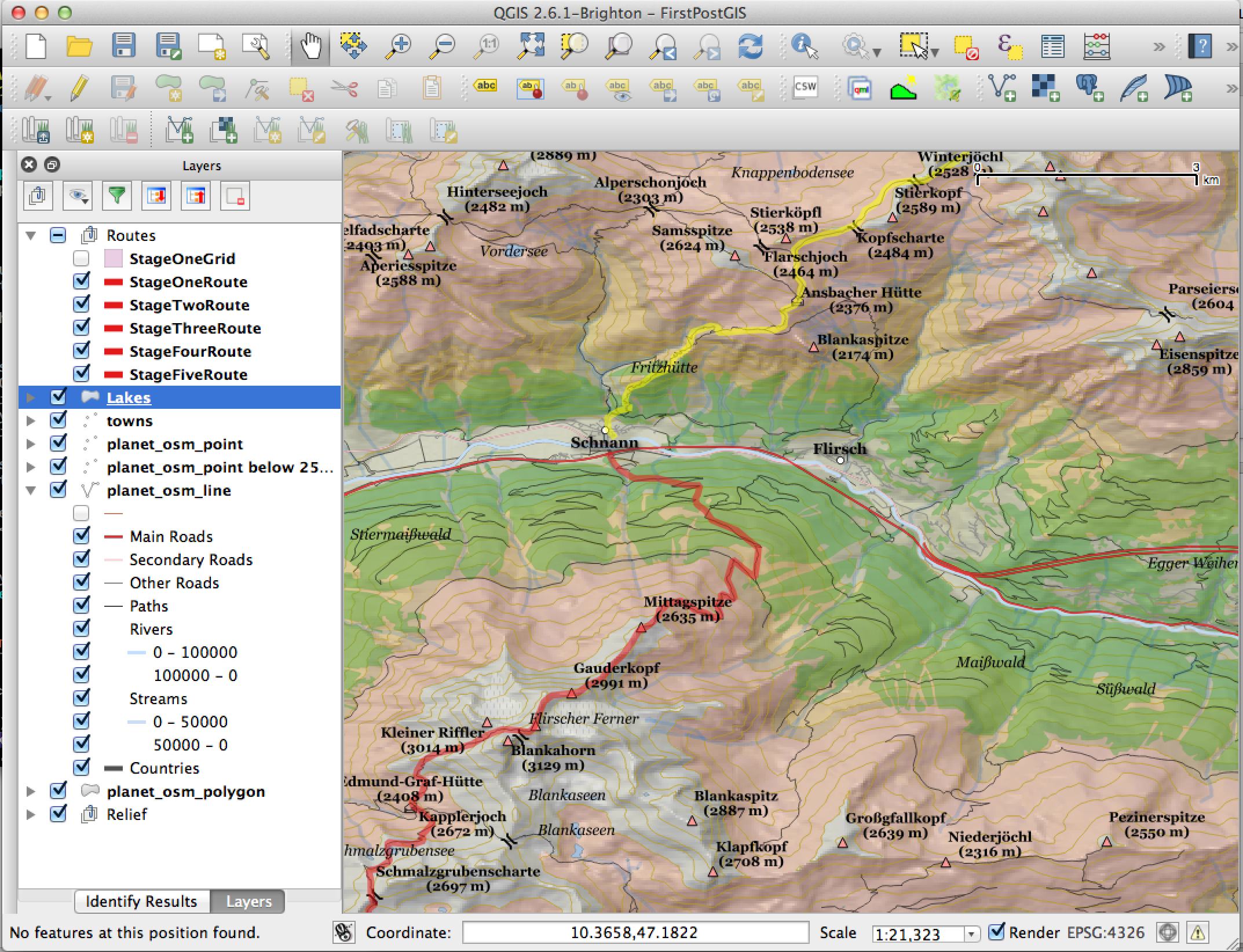
And here is my work in QGIS, focusing on a portion of my planned hike. It really took a lot, lot, lot of fiddling around with the layers to get output that displayed the appropriate amount of information for each map scale. There is just so much data in OSM. It sounds simple, but deciding upfront what features you want to see on your map and including them one by one is better than filtering data out.
TileMill uses a different approach to style the map, called CartoCSS. It's powerful and textual which I like better than fiddling around in dialog boxes in QGIS. But before I have anything ready to display I need to do some work on my raster data, creating "pyramids" of image tiles to select the right one for the current zoom level.